April 25, 2018

Week 13 - Non-Commerical Art (25 April 2018 - HW14)

Phones lined up by Pixabay.
Phones Lined up by Alexa Fotos
~

The color harmony while random might be close or similar to a monochromatic scheme. Despite the other telephones having some black, in some ways it could have a bit of very dark green. The background, however, does aid the scheme by adding a variety of greens to make the background and foreground look interesting.It's possible the objects are showing depth by proximity as each object is behind one another (slightly).

~

Source: Alexa_Fotos. "Free Image on Pixabay - Phone, Models, Generations, Old." Phone Models Generations · Free Photo on Pixabay. Pixabay, 11 Sept. 2016. Web. 25 Apr. 2018. <https://pixabay.com/en/phone-models-generations-old-1662191/>.
April 17, 2018

Week 12 - Symbolic Colors (17 April 2018 - HW13)

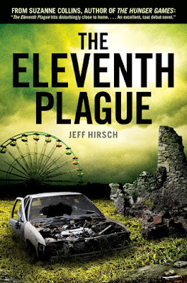
Book cover for The Eleventh Plague.
Book cover for The Eleventh Plague
~

The book is based on a post-apocalyptic setting. Having a variety of greens adds to the feeling that radiation still lingers in the world. Having the text be black is not for printing purposes but to establish the grimness of the situation. The rusted colors on the car and stone add how the radiation and damages from the war impacted these objects that we see every day. While there is some light on the clouds, mostly everything uses a dark color scheme to, again, represent the situation and that this book is not a happy and joyful book but rather a serious and grave situation.

~

Source:  Hirsch, Jeff. "The Eleventh Plague-Sample." Scribd. Scribd, 2011. Web. 17 Apr. 2018. <https://www.scribd.com/doc/62326036/The-Eleventh-Plague-Sample>. The book can be found at the Urbana Free Library.

April 11, 2018

Week 11 - Color Discord (11 April 2018 - HW12)

Writer's Digest magazine cover.
Writer's Digest Magazine Cover
~

The magazine uses complementary colors to emphasize certain elements. Since it is a writer's magazine, the pencil is given an orange color along with the magazine's background emphasizing Writer's Digest as important. The orange 3D block and the numbers have different tints and shades of orange emphasizing what the magazine will discuss. The background color is not only pleasing to the eyes but it helps with the contrast so the orange elements can be emphasized.

~

Source: Writer's Digest May/June 2018 found at Parkland Library.

April 4, 2018

Week 10 - Creativity (4 April 2018 - HW11)

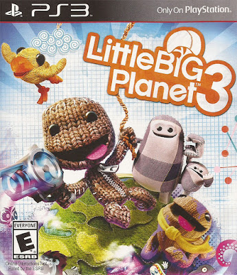
Cover design for LittleBigPlanet 3.
Cover design for LittleBigPlanet 3
~

The video game cover for LittleBigPlanet 3 was made creatively by introducing long-time fans with new playable characters and new tools to use. New-time fans will get some joy by learning of all these figures. By how expressive and colorful the design is, it's uncommon to find a design this joyful for its' time. Adding on that this game has a feature to allow the player to make their own custom levels and share them online, thus adding not just creativity to the cover but creativity to the entire game as a whole.

~

Source: LittleBigPlanet 3 developed by Sumo Digital.

March 27, 2018

Week 09 - Color Harmony Rules (27 March 2018 - HW10)

Cover for Stressful Farming that uses Triad colors.
Cover for Succesful Farming that uses Triad colors.
~

The magazine cover for Succesful Farming uses triad colors of yellows, blues and reds. Each colors helps with the design, such as how the yellow in Farming can indicate the energy of farming and the labor that comes with it. The blues help the yellow stand out making a better impact. While the red can be an emphasis for the magazine's main story.

~

Source: Succesful Farming magazine from Parkland College's library.

March 14, 2018

Week 08 - Color Inspiration (14 March 2018 - HW9)

Cover for Sky & Telescope.
Mosaic colors from the Sky & Telescope cover.
Mosaic colors from the Sky & Telescope cover.


~

The magazine cover for Sky & Telescope has a interesting color palette as it uses a mix of mostly dark colors with contrasting high colors such as the different tints of purple. Black is a common color to mix with other colors as most colors have a higher contrast when paired with black. On a personal note, it mixes some of my favorite colors such as purple and black to create a stunning imagery.

~

Source: Sky & Telescope magazine.

March 7, 2018

Week 07 - Positive/Negative Space (7 March 2018 - HW8)

Cover design for the Journal of Development Education.
Cover design for the Journal of Development Education
~

The cover design fills the positive space of the numbers with a photograph of flowers in a grassy field. The negative space has a maroon color, in a way, it’s using opposite colors to give the flowery field emphasis of peace or serene while using the negative space to form the numbers and the design. The same goes for the logo on the top left which uses the negative space to create a silhouette or the company's logo. The colors don't blend in together to where it's hard to see but rather it unifies the elements to make good use of both positive and negative space.

~

Source: The Journal of Development Education magazine found at Parkland Library.

February 19, 2018

Week 05 - Depth (19 February 2018 - HW6)

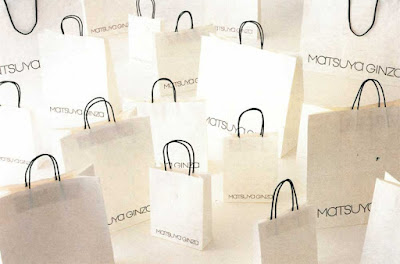
Bags for Matsuya Ginzo
~

The photography shows depth by overlapping bags over other bags. Not only that but the angle of each bag that is positioned gives off values on its sides and on its cast shadow. Since each bag is angled differently and at different heights, the bags at the front are darker given the sense of depth that someone is standing near the bags. While the bags in the back have a deeper value it can represent that the backs are far enough to avoid the person's shadows.

~

Source: Kozak, Gisela, and Julius Wiedemann. Japanese Graphics Now! Köln: Taschen, 2006. Print.

February 14, 2018

Week 04 - Rhythm (14 February 2018 - HW5)

Illustration of sponges.
~

The illustration has rhythm across the artwork with the round cylinder shapes. The shapes are aligned diagonally and are given even space which results in a pattern on the top of the shapes. The pattern is consistent throughout the artwork as it forms a staircase pattern that represents rhythm.

~

Source: The book doesn't have an exact title but the closest I found was Japanese Art on the graphic design section, 2nd floor in the Parkland Library.

February 7, 2018

Week 03 - Balance (7 February 2018 - HW4)

Image of a boy and monkey with a battery in the middle.

~
The photograph has a balance between the two figures and the one object. Both the young boy and the monkey wearing a head gizmo and relatively similar in height. The battery is located in the middle and while there are some cords sticking out to the right of the battery, it is still approximately symmetrical. The background and the black border are relatively the same with only the text being on the right side. But like stated earlier, the position of the figures and objects make it an approximate symmetry.

Source:
Navta Journal (June/July 2015)


January 31, 2018

Week 02 - Unity (31 January 2018 - HW3)

Untitled (Ocean) made in 1969 by Vija Celmins.
Untitled (Ocean) by Vija Celmins
~
The drawing has a lot of unity with how each element including the shadows, lights, values and gradients all mix together well to produce a realistic ocean design. The elements don't argue with each other to where it loses it realism but work together to create a beautiful drawing.
~

Source
Stewart, Mary. "Unity and Variety." Launching the Imagination: A Comprehensive Guide to Two-Dimensional Design. 5th ed. New York: McGraw-Hill Education, 2015. 66. Print.

January 24, 2018

Week 01 - Variety (24 January 2018 - HW2)

Open books stacked with other open books.
~

The stacked books show a range of variety by displaying different images with different things going on each one. No image is the same as the last one thus offering a range of different shapes and color through the entire image.

~

Source: Image from Communication Arts - November 2004 Edition.